By Erin Irish

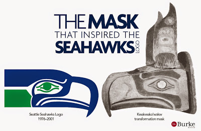
Over the years, the Seahawks logo has evolved from being a drab aloof hawk to a fierce darker hawk that looks like it might draw blood. For the first 25 years, the logo had lighter colors. The eye of the hawk was pleasant and it had an almost smirking pout. In 2000, the team was in the process of designing new uniforms and attempted to change the logo. The main suggestion was that the hawk should have a red eye to look more intimidating. They would’ve had red eyes themselves from crying over how unfortunate that logo would’ve been if they’d chosen it. From its origin, the hawk has had a green eye and this continues to be the shade of choice. In 2002, the logo became more ominous because the royal blue head of the hawk changed to a much darker blue and the green neck to a sea blue. The eye of the hawk was given an aggressive and angry glare. Presently, it is the same hawk from the last revision, but now is different colors. In 2012, the head of the hawk changed to navy blue and the neck changed to wolf grey. The logo was inspired by the tribal art of coastal natives. The source of inspiration is believed to be a mask found in anthropologist Robert Bruce Inverarity’s 1950 b00k The Art of the Northwest Coast Indians. It was a Kwakwaka’wakw transformation mask of an eagle into a man. When the mask is closed it portrays an eagle, but when it is danced or manipulated, it opens to show a human face inside.


